EN
EN



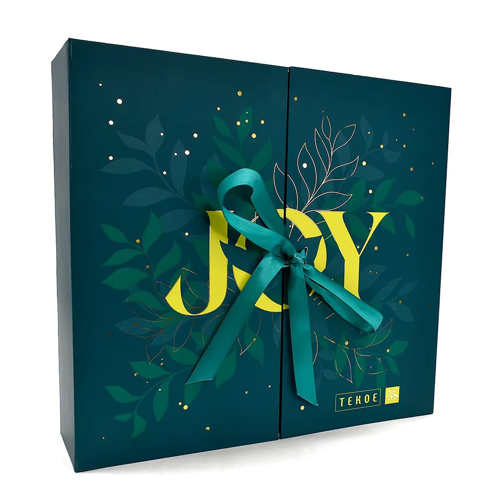
The Science Behind Color Psychology Branding Strategy
Color perception begins as wavelengths hit retinal cones, but the real work of color psychology branding strategy unfolds deep within the brain’s emotion centers—before conscious thought engages.
Neurobiological foundations: How color triggers amygdala-driven emotion and prefrontal modulation
Light enters the eye and travels along specialized pathways that bypass the visual cortex, routing directly to the thalamus and then the amygdala—a key hub for fear, pleasure, and rapid emotional tagging. This subcortical route processes color in roughly 50 milliseconds, triggering an immediate affective response long before the prefrontal cortex applies rational modulation. Warm hues like red and orange elevate arousal via amygdala activation; cooler blues and greens often prompt parasympathetic calming. While the prefrontal cortex later regulates this response, the initial emotional imprint is already set—explaining why a well-chosen packaging colors palette can evoke trust, excitement, or serenity without a single word. That speed and primacy make color a cornerstone of effective color psychology branding strategy.
Why packaging color bypasses rational evaluation—evidence from eye-tracking and fMRI studies
Eye-tracking studies show color elements capture fixation within 90–100 milliseconds—well inside the pre-conscious attention window. Functional magnetic resonance imaging (fMRI) confirms heightened amygdala activity immediately after exposure to saturated packaging hues, while the dorsolateral prefrontal cortex—the seat of deliberative reasoning—activates only later, if at all. This temporal gap means packaging color shapes preference and emotional valence before consumers weigh ingredients, price, or brand claims. The brain “feels” the color’s narrative before it “thinks” about the product. Because rational evaluation is slower and cognitively costly, a compelling color treatment anchors a positive impression that subsequent logic struggles to overturn—giving packaging colors a direct, evidence-backed channel to consumer decision-making.
Packaging Colors by Product Category: Emotional Alignment & Consumer Expectations
Category-specific color appropriateness: Green for organic skincare, blue for tech trust, red for energy drinks
A strong color psychology branding strategy starts with aligning package hues to category norms. Green dominates organic skincare and wellness brands—not just because it signals nature and health, but because research shows consumers perceive green packaging as fresher and more environmentally responsible, reinforcing functional and emotional promises. Blue, evoking calm and reliability, has become the default for financial services, cloud software, and health technology—its trust-signaling power critical where security drives purchase decisions. Red increases heart rate and appetite, explaining its dominance on energy drinks and snack packaging, where urgency and excitement fuel impulse buys—especially when paired with bold typography. These crossmodal correspondences reduce cognitive load and accelerate preference formation at the first moment of truth.
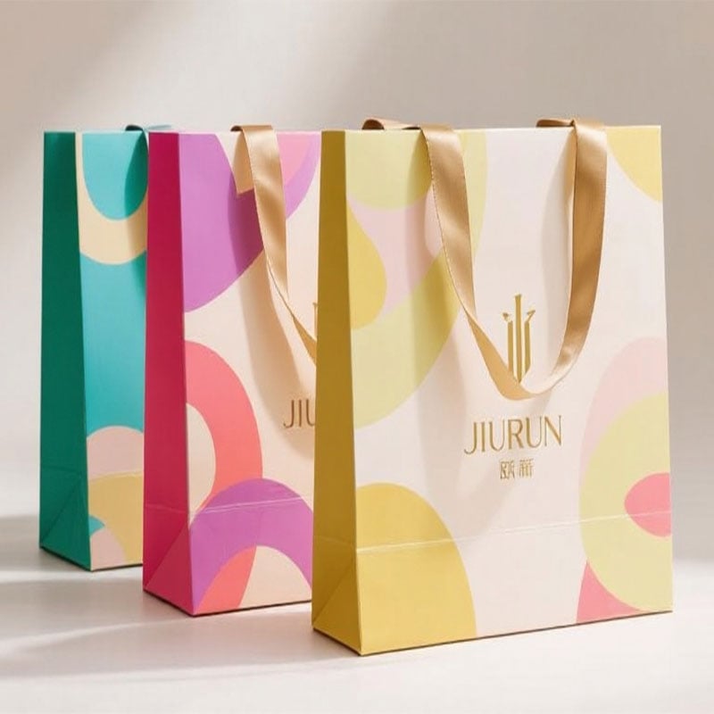
Contextual modifiers: How shelf adjacency, lighting, and cultural framing reshape color meaning
Even the most strategic color selection shifts depending on context. Shelf adjacency amplifies contrast: a green skincare jar amid fiery red competitors appears calmer and more natural, strengthening its eco-positioning. Retail lighting also alters perception—warm, yellow-toned lights mute blue’s crispness, while cool LEDs intensify reds and oranges. Cultural framing further complicates interpretation: white signifies purity in Western markets but mourning in parts of East Asia; orange may signal affordability in one region and premium quality in another. Leading brands mitigate these variables by testing packaging under simulated in-store conditions—measuring dwell time and emotional response across lighting setups and cultural panels—to ensure packaging colors deliver intended emotional alignment, regardless of shelf or shopper.
Strategic Color Use for Shelf Impact and Long-Term Brand Recognition
The isolation effect: High-contrast palettes increase dwell time and recall (EyeTrackShop, 2024)
High-contrast color combinations exploit the isolation effect—the cognitive principle where a stimulus that differs starkly from its surroundings seizes attention instantly. Eye-tracking research confirms packaging with a strong dominant hue and sharply contrasting accent holds shoppers’ gaze up to 0.7 seconds longer than low-contrast alternatives (EyeTrackShop, 2024). That extra dwell time translates directly into higher unaided recall. A dark chocolate bar in a bright-orange wrapper, for example, breaks the sea of browns and golds in confectionery aisles. This aligns with color psychology branding strategy: when the brain registers an unexpected visual signal, the amygdala triggers an orienting response—and the prefrontal cortex labels it as novel and worth remembering. For marketers, contrast plus strategic color choice ensures packaging does more than grab attention—it embeds the brand into memory, building durable loyalty and repeat purchase.
Balancing visibility and positioning: Why luxury brands avoid neon despite superior shelf stand-out
While neon hues guarantee maximum shelf stand-out, luxury brands deliberately avoid fluorescent palettes. Bright, saturated colors often signal affordability, youth, and spontaneity—traits misaligned with restrained elegance and timelessness. Instead, premium brands use deep blacks, muted metallics, and subtle accents to project exclusivity. This visual restraint sacrifices a fraction of immediate detection—but reinforces a brand persona that resonates with discerning buyers. In luxury, color psychology branding strategy prioritizes long-term perceived value over momentary attention, proving that not all high-contrast choices serve every market tier.
Color Psychology Branding Strategy in Sustainable Packaging
Muted earth tones vs. vibrant greens: Trade-offs between eco-credibility and impulse appeal (NielsenIQ A/B test, n = 2,147)
In sustainable packaging, color psychology branding strategy must reconcile eco-authenticity with purchase urgency. A NielsenIQ A/B test (n = 2,147) found muted earth tones—beige, moss, brown—boosted perceived eco-credibility by 28%, signaling genuine sustainability. Yet vibrant greens triggered 19% higher impulse appeal, leveraging the brain’s rapid association of bright green with “natural” and “fresh.” This trade-off demands category-specific calibration: earthy palettes deepen trust for premium eco-brands, while saturated greens accelerate shelf grab for mass-market green alternatives. Without careful alignment, a brand risks appearing greenwashed—or failing to attract the impulsive eco-conscious shopper.
Frequently Asked Questions (FAQs)
What is color psychology branding strategy?
Color psychology branding strategy involves using specific colors to evoke desired emotions and behaviors in consumers, influencing their perception of a product or brand.
Why is color important in packaging design?
Colors impact consumer decisions emotionally before rational evaluation, making them a powerful tool in creating immediate connections, trust, and preference for a product.
How does context affect packaging color meaning?
Factors such as shelf adjacency, lighting, and cultural framing significantly alter how colors are perceived, influencing their impact on consumer behavior.
What are some effective colors for specific product categories?
Green is ideal for organic products, blue is suitable for tech and financial industries, and red is effective for energy drinks and snacks due to their category-specific emotional alignments.
How do sustainable brands balance eco-credibility and impulse appeal?
Sustainable brands use muted earth tones for trust and authenticity, while leveraging vibrant greens to attract impulsive eco-conscious buyers.